Katie’s Tiny Kitchen Turned "Fancy Pantry": a BTS Look at Our House Beautiful Feature
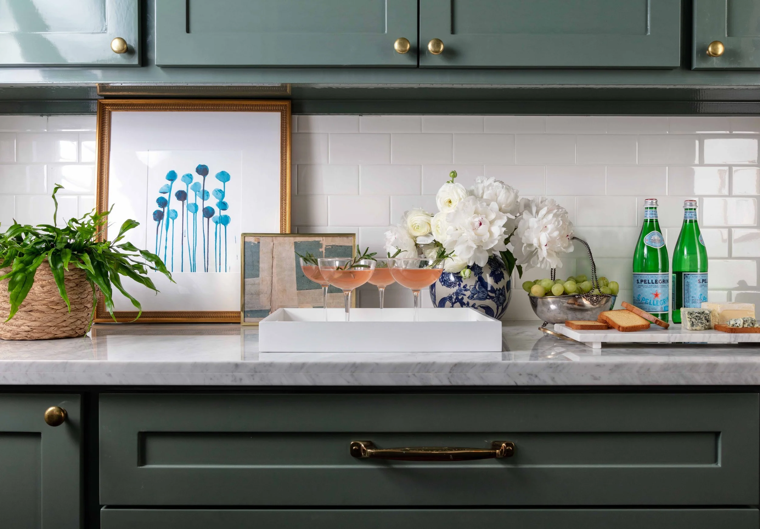
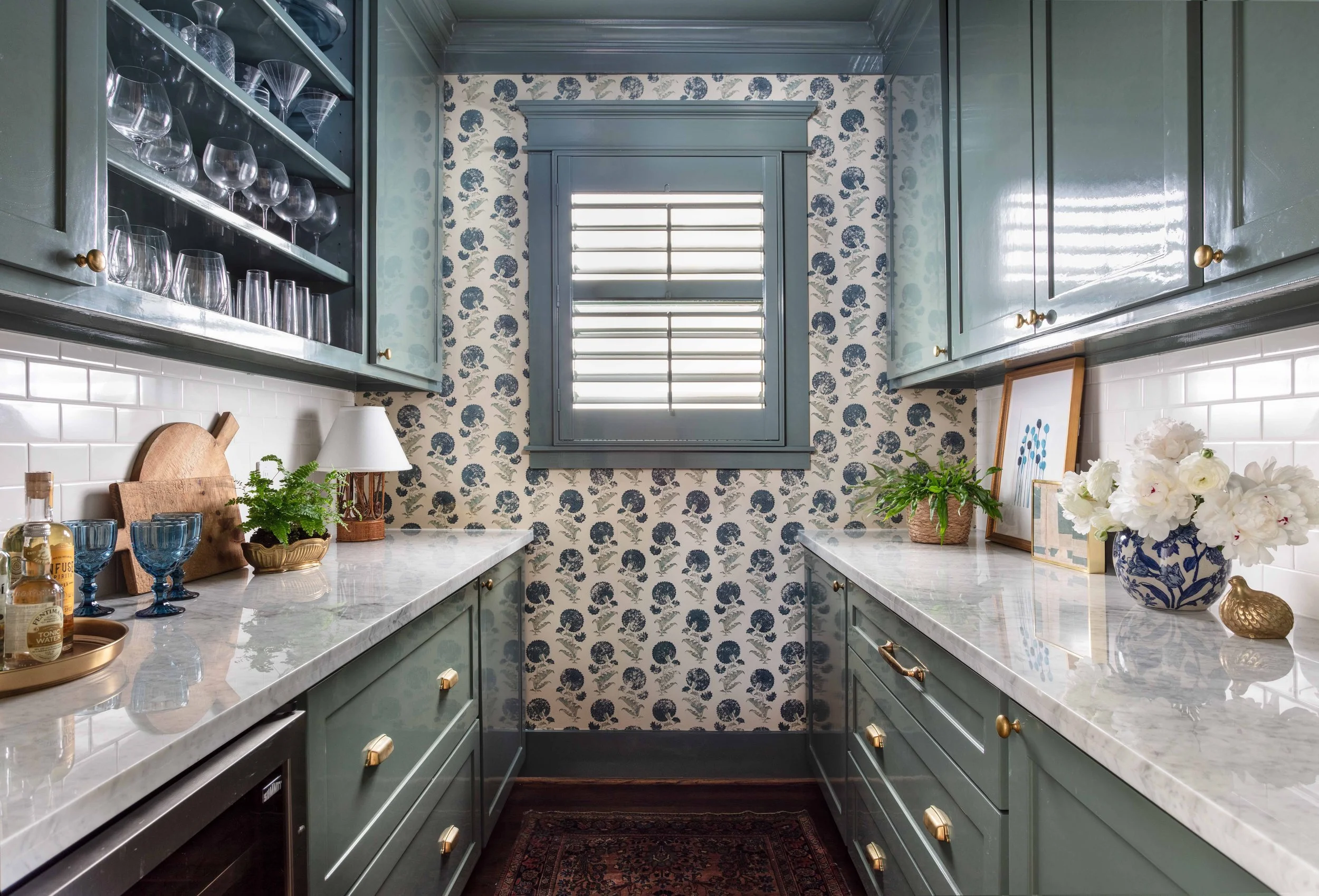
Huge news! Katie’s own bar in her personal home was featured on House Beautiful this past week! She has long referred to this space as her “Fancy Pantry” — a combo bar, pantry and prep area. It gets a ton of use day-to-day and it deserved the ‘Katie Davis treatment’. The final look is decked out in green lacquer and bold floral wallpaper. What’s interesting about this space is, at one time, it was actually a kitchen! When Katie and her husband, Billy, purchased their historic bungalow in the Houston Heights, the home ended at a teensy kitchen. An extensive renovation led to a major add-on, and this space became the family’s bar. At the time of the renovation, Katie opted for a neutral palette to blend into the rest of the home. But in the back of her mind, she always knew the petite room was destined for more. Here we take you behind the scenes of the original renovation, and the subsequent glow-up of the Davises’ ‘fancy pantry’. Let’s dive in!
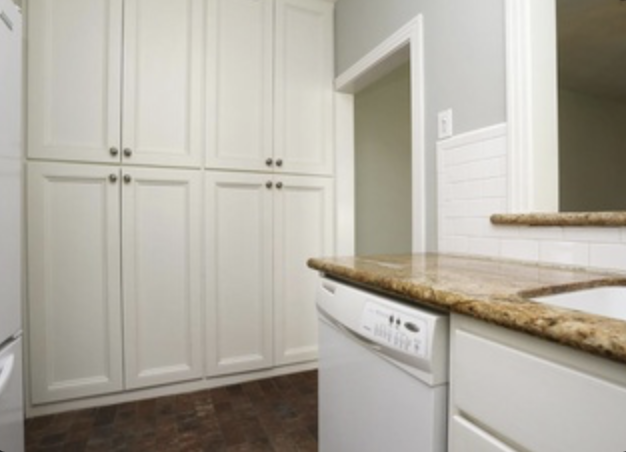
When Katie and her husband, Billy, first purchased their 1920’s bungalow, the space now coined the “fancy pantry” was actually the kitchen. Katie remembers: “We called it our ‘one butt’ kitchen, because two people could not comfortably be in there at the same time.” They were quick to renovate the home, and add onto the back — adding a larger kitchen which opened to a dining area and family room. The natural fit for the old galley kitchen was a bar.
As House Beautiful stated, when they initially renovated the home, the space had been designed in a simple gray-and-white color scheme during the reno/addition build for simplicity's sake. The rest of the home was more neutral, so they embraced a minimalistic palette, just with darker gray tones and pops of unlacquered brass. As they used the space, everyone would call it the ‘fancy pantry’ or the ‘fancy bar’, so Katie wanted to fully commit to that nickname and add some impact in the form of wallpaper and Lacquer. It was always the plan for this room. But as they say, the cobbler’s children…
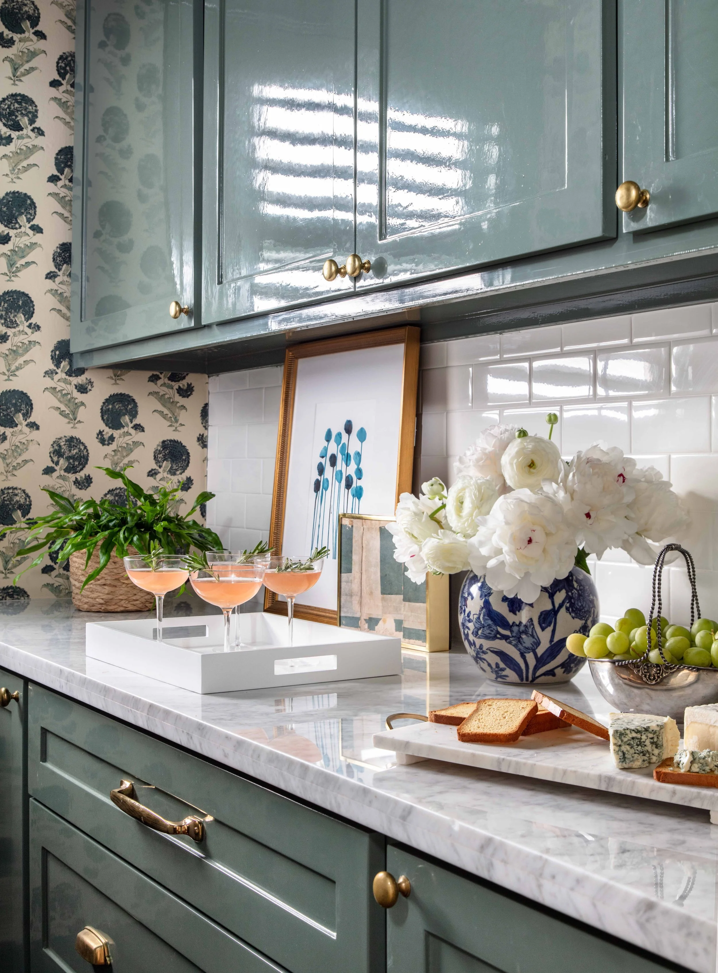
Katie always liked the idea of patterned wallpaper and bold Lacquer in such a jewel box space. She loves the Indian Flower print in blue from Jasper Fabric, so that served as a starting point. From there, she pulled the color Card Room Green from Farrow & Ball for the Lacquer. It felt cohesive with rest of the house, but still stood out and added some drama. It is now truly a jewel box. And now that it’s actually fancy, they get so much more enjoyment out of using it.


